Re-designing Santander’s personal banking apps

Instilling design discipline for an evolving banking experience

I was contracted by Jam @ EngineGroup to manage the UX and Creative teams responsible for re-designing Santander’s native banking apps and parts of their web banking for personal customers.

Foundations for an efficient team

When I joined, the team had embarked on the iOS mobile application designs, but with very little project structure in place. Nor was there the necessary level of fidelity or finesse in design documentation. Without improvement, Santander’s development teams would be left with a lot of guesswork and the user experience would be sub-standard.

My first task was to understand the project goals and status, then see how the team had been approaching the task of delivering designs.

Once I had established where improvements to the process could be made, I communicated these to the agency account team and client stakeholders, buying time to get our house in order, but promising efficiencies in the longer term.

Quality control from start to finish

Out would go the use of Photoshop for initial designs. I insisted that everything started as pen on paper and that sequences of screens and states were storyboarded or paper-prototyped.

With wireframes having never been sold into the client and the agency committed to polished designs throughout, I set about developing a set of Photoshop templates. These carried all necessary design elements, perfectly aligned to a layout grid. No longer would the team deliver pixel-jumping designs with an assortment of hex values for Santander red.

iOS app Photoshop file

Another change to the way of working was an insistence that everything was reviewed on the device it was designed for. Initially this was just casting or copying jpegs to the iPhone or iPad, but I also set up sequences of screens in Adobe Dreamweaver (this was before the luxury of Adobe XD or InVision).

picture of a woman holding an iphone with the santander mobile banking app on the screen
Design documentation

The redesign was accomplished in sprints, tackling sections of the app one at a time. However, to ensure consistent experience throughout, I asked that the team document patterns, such as form and calendar behaviours. I also started a digital style guide for internal reference, but ultimately for the Santander developers.

Working with the bank’s own UX and insights departments, we replaced a dated design with brand new apps across devices on iOS and Android. The project included introducing new patterns, additional functions and evolving the digital brand, for which full guidelines were written.

Excerpt from the style guide
Exploring future banking

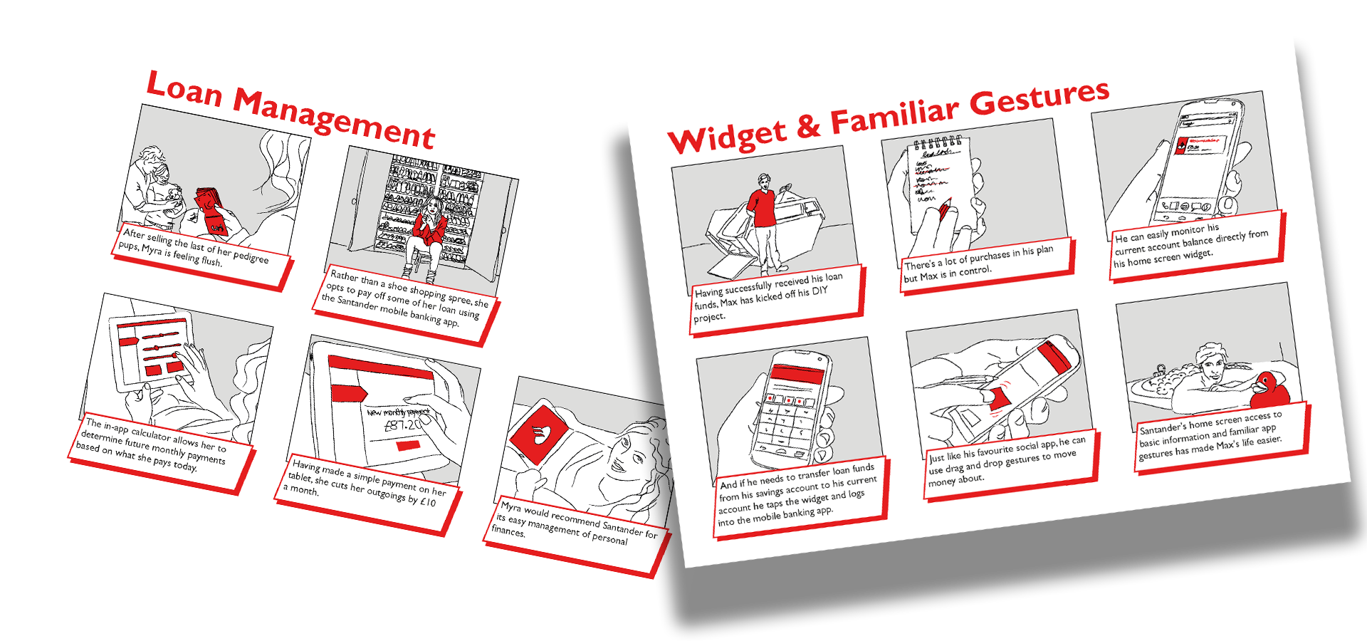
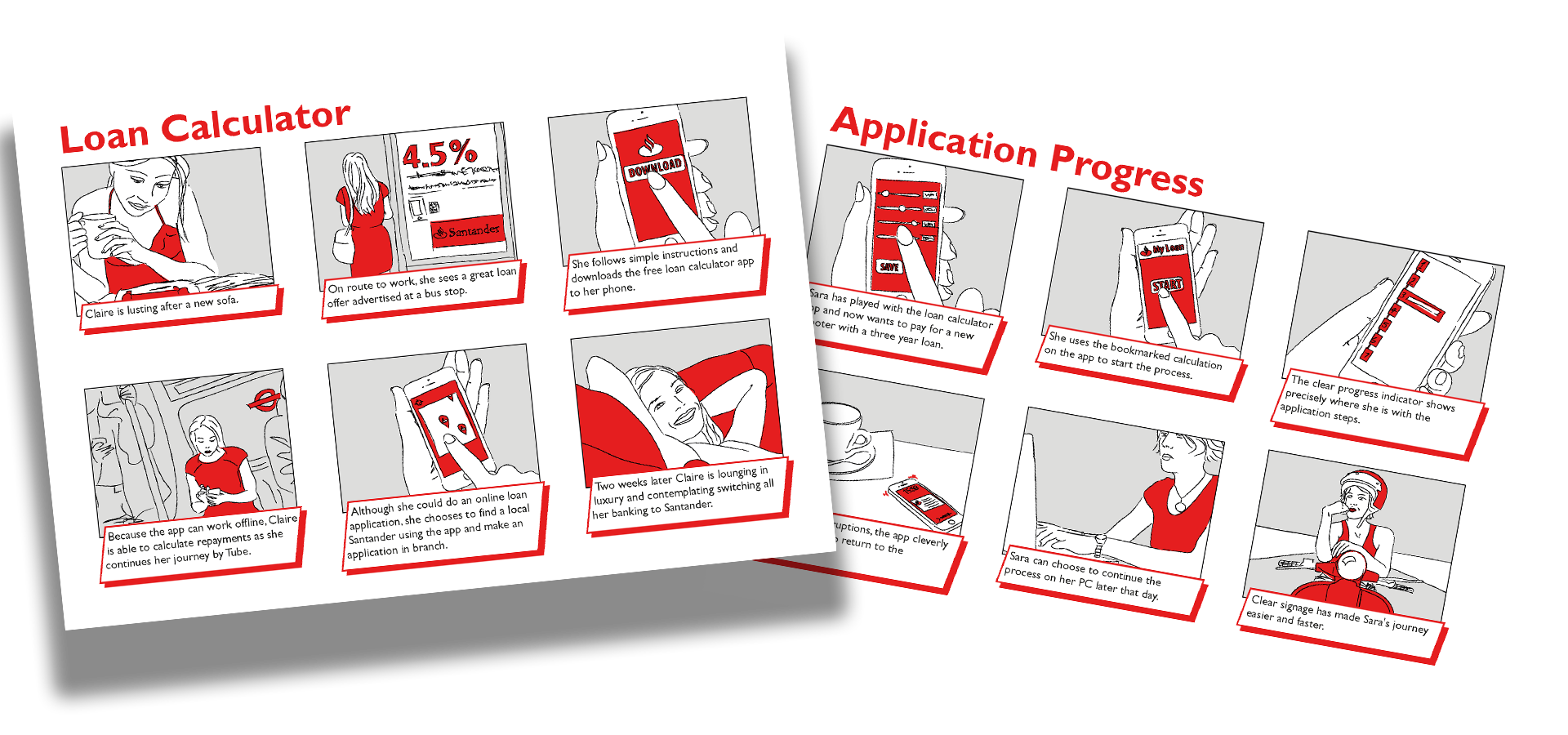
With an efficient team delivering designs to the desired standard, I was able to work with Santander stakeholders to investigate prospects for service enhancements. Whilst some of this work was about surfacing new products within existing apps, some explored changes in user behaviours and expectations. I wrote documents covering many areas and drew the occasional storyboard to bring to life some of the ideas. These were presented to the client during strategy and planning sessions.

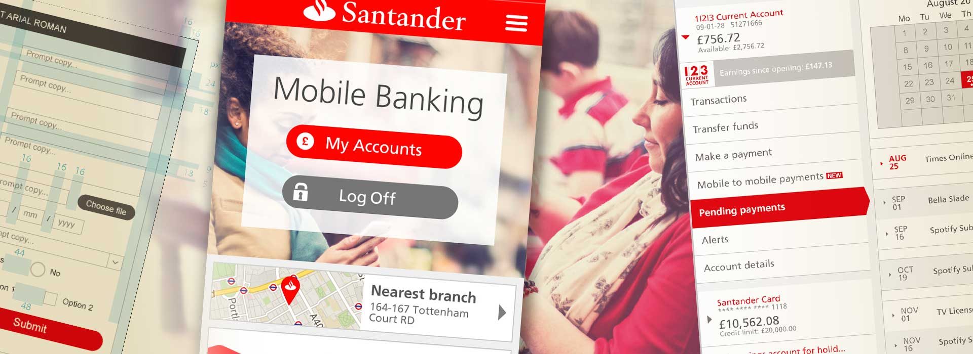
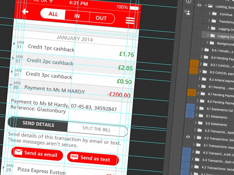
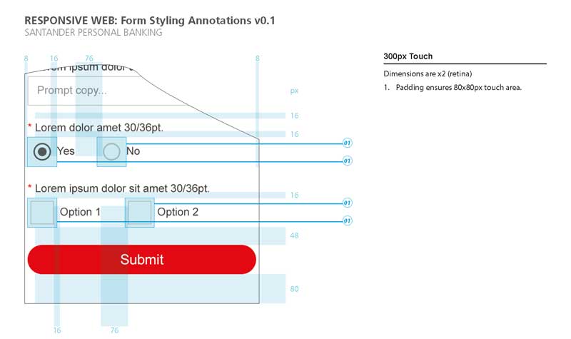
During the summer I was at Jam, we delivered the complete iOS designs for mobile and iPad and the beginnings of the Android version. We also provided revisions for the Santander online banking website and comprehensive style guides for all these digital properties.

Share
Share this Post
Your URL copied
Top